


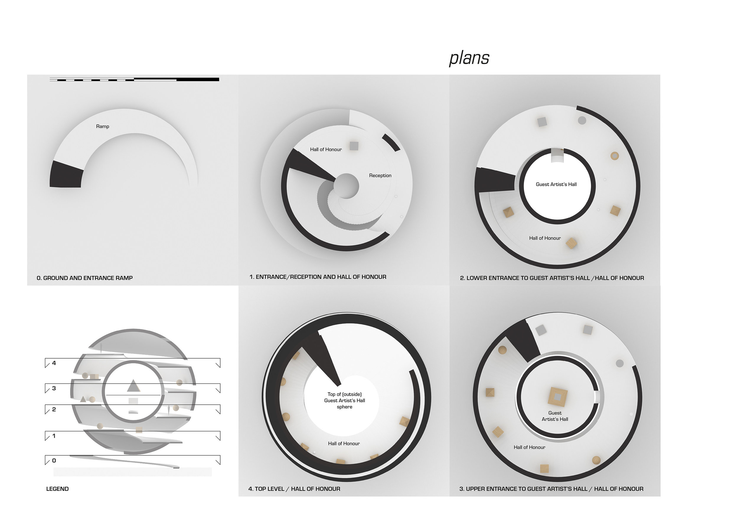
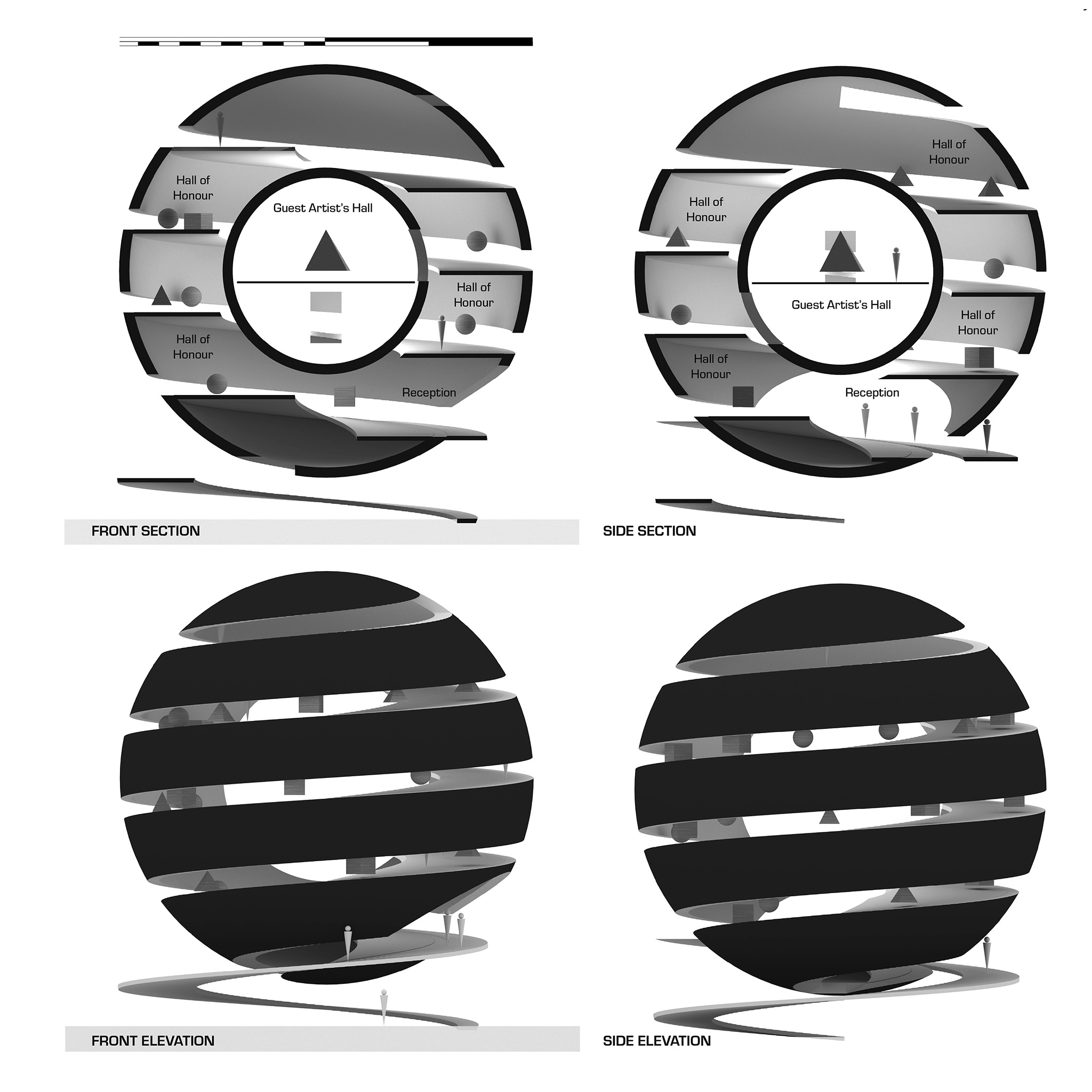

Elevate is an Honorary Mention entry for the Bee Breeders Archhive: Architecture in Virtual Reality architecture competition. The design target was Vividly’s web based VR solution and architecture projects would be exhibited in 3D and 360. My concept was for a free standing elevated space where one would understand the design and navigation from the outside, rarely afforded in real-life museum architecture due to natural light being carefully controlled.

The most important User Experience design consideration for VR is comfort. This is largely driven by the hardware platform but also in ones choice of spatial layout and movement design. A continous ramp combined with the cuts into the sphere and a central core aid in navigation.

The core serves a dual function containing the Guest Artist’s Hall and as a light for the spiral ramp that is the Hall of Honour. The ramp contain 25 projects where the first five lead the visitor up to the lower entrance of the Guest Artist’s Hall. While gaze based teleporation generally provides great comfort care should be taken to aid the user with navigation. Teleportation points, projects in my case, are placed within viewing distance.

Projects are placed as “floating” models (shown as wooden cubes and pyramids here) and (if technically possible) 360 panoramic spheres (shown as spheres) along the ramp, one leading the eye to the next in the Hall of Honor. The Guest Artist’s Hall exhibition space is reached from two places along the ramp, the first giving access to the lower part of the central sphere.

The reception area and entrance to the Hall of Honor is located at the merging of the inside and outside ramps. The Guest Artist’s Hall can also be reached higher up on the ramp in the Hall of Honour. The Guest Artist’s Hall as shown has a traditional floor in the middle of the sphere (60m2) however by removing the floor a fully spherical space can be created.

The material limitations for textures and colors is a challenge in any mobile VR app. The curved surfaces would require baked indirect lighting to accurately reflect the design. The building should ideally have one complete texture each for the outer shell, inner shell, ramp (Hall of Honor space) and Guest Artist’s Hall sphere (inside and outside) that include light baking of at least 2k squared each depending on the real-time 3D engine used with Vividly.

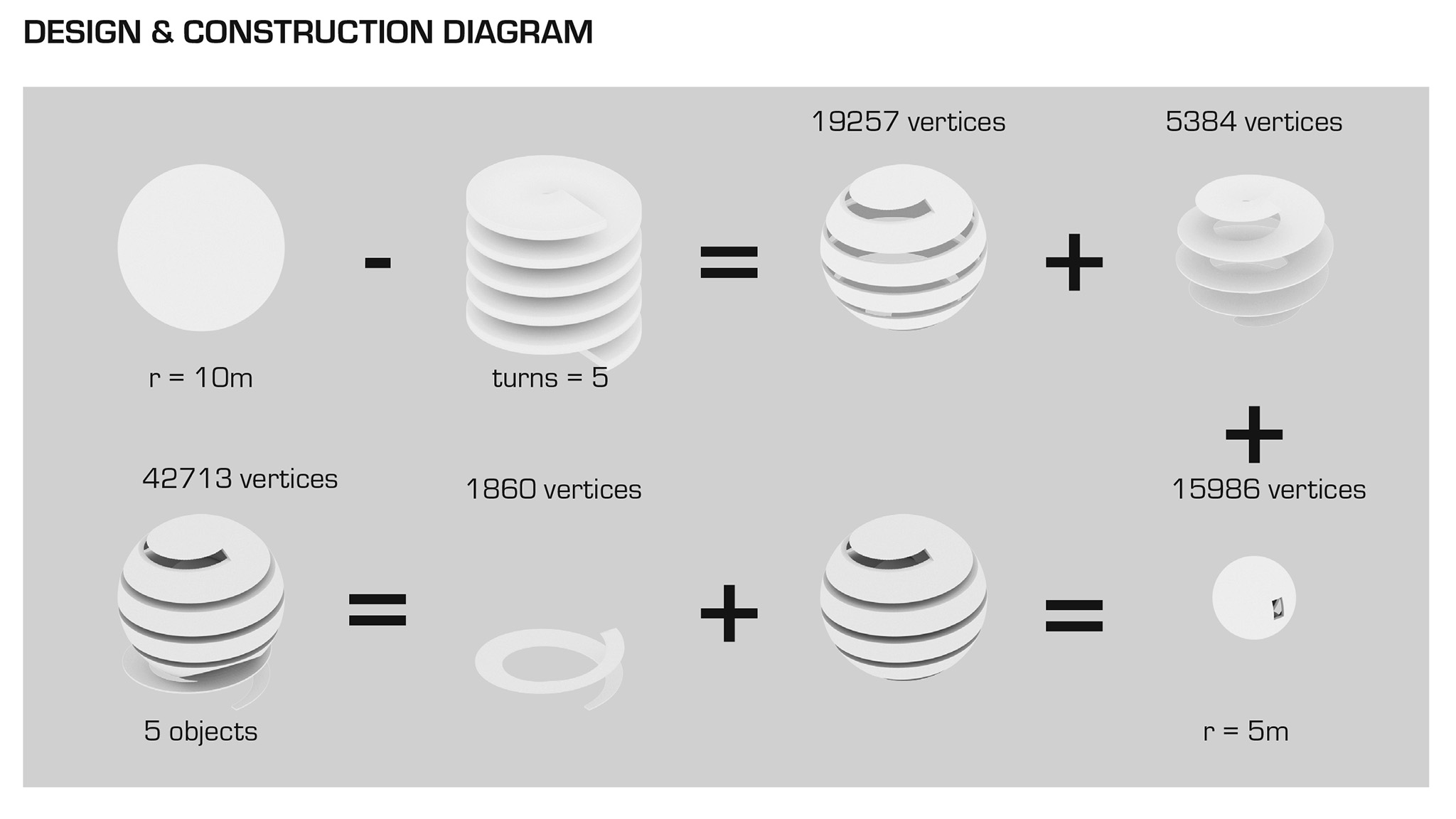
Having curved surfaces look smooth is challenging on a mobile platform but is nevertheless the essence of this project. Care has been taken to limit the amount separate objects and the number of polygons (vertices) or divisions used in constructing the spherical objects as described in the diagram.

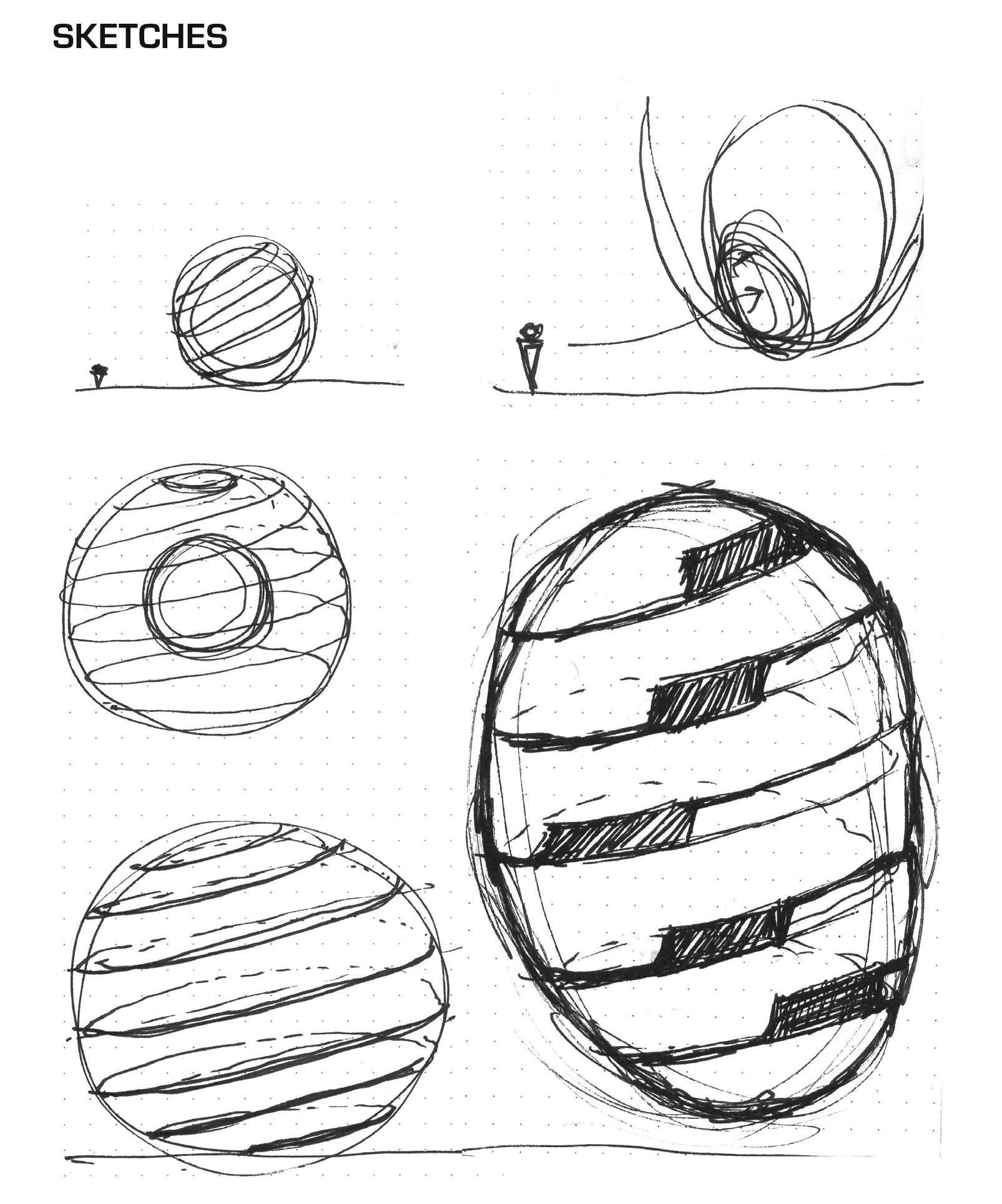
While most of my initial ideas were captured in the final design I would have liked to have more variation to the cut - the peel - as shown in this sketch. Time ultimately restricted this as a very time consuming and careful modeling of individual polygons was needed to optimize the design for mobile VR.