





For Norwegian company Dimension10, now part of the leading Finnish VR company Varjo, I was asked to design a new architectural workspace for their state-of-the-art collaboration and visualisation VR software for the AEC industry.

Dimension10’s existing room, or building really, had a number of qualities we wanted to retain and some that needed improvement: a generous space under a dome allowing ample daylight and views to sky and nature, and a large circular primary floor surrounded by secondary non-functional rooms and areas.

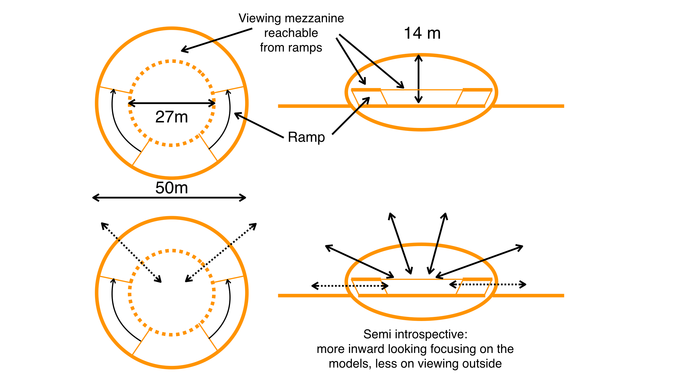
In the architecture of Frank Lloyd Wright the idea of compression and release and the prospect refuge theory are key in creating comfortable and interesting architectural spaces. A combination of low ceilinged pavilions and the high ceiling plaza is my take on these concepts. The ramps inspired by FLWs Guggenheim museum were abandoned for being too costly in time and polygons and taking up too much space.

Initial ideas were rooted in Norse mythology, and specifically the world tree Yggdrasil as a metaphor for a space connecting virtually to other spaces around the globe. I wanted to use wood in the structural design for its restorative effect and in connecting the design to Dimension10s cultural and visual identity. Surrounding the main floor are spaces for smaller workspaces with a lower ceiling.

In dividing the large circular surfaces of both the main floor and the surrounding interior landscape, I took inspiration from nature in the columnar jointed basalt pillars that can be found in volcanic flow fields.

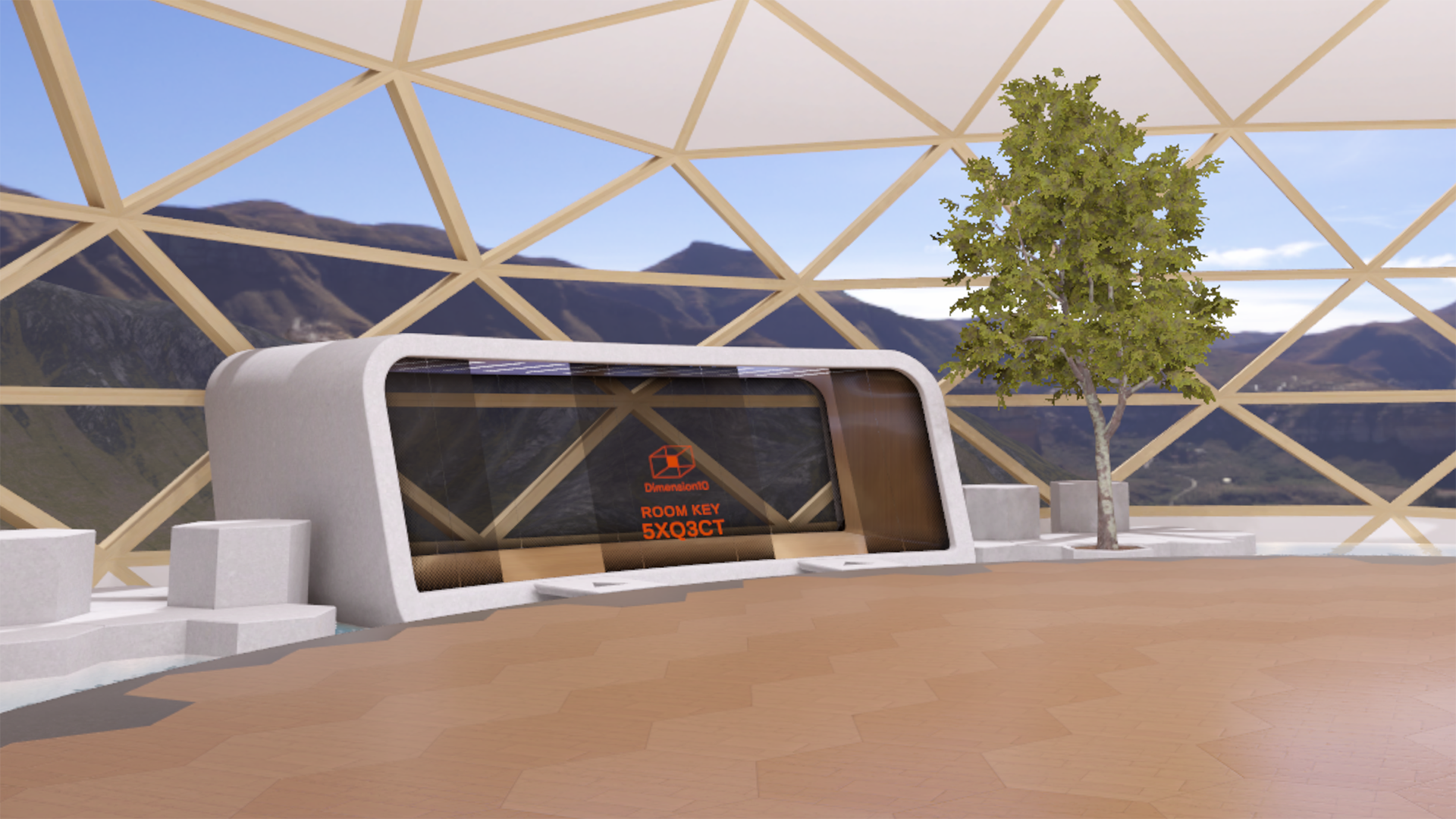
The main work space is more like a plaza and less like a meeting room. A large room makes it possible to see 3D models to scale in the space and it is also a more generous and relaxing space to be in. The main floor seen in this image would later be changed to a lighter, warmer material. The compressed dome is a geodesic sphere which is both the most effective way in reality (and VR) to enclose a spherical space and also a nod to futurism and the construction industry.

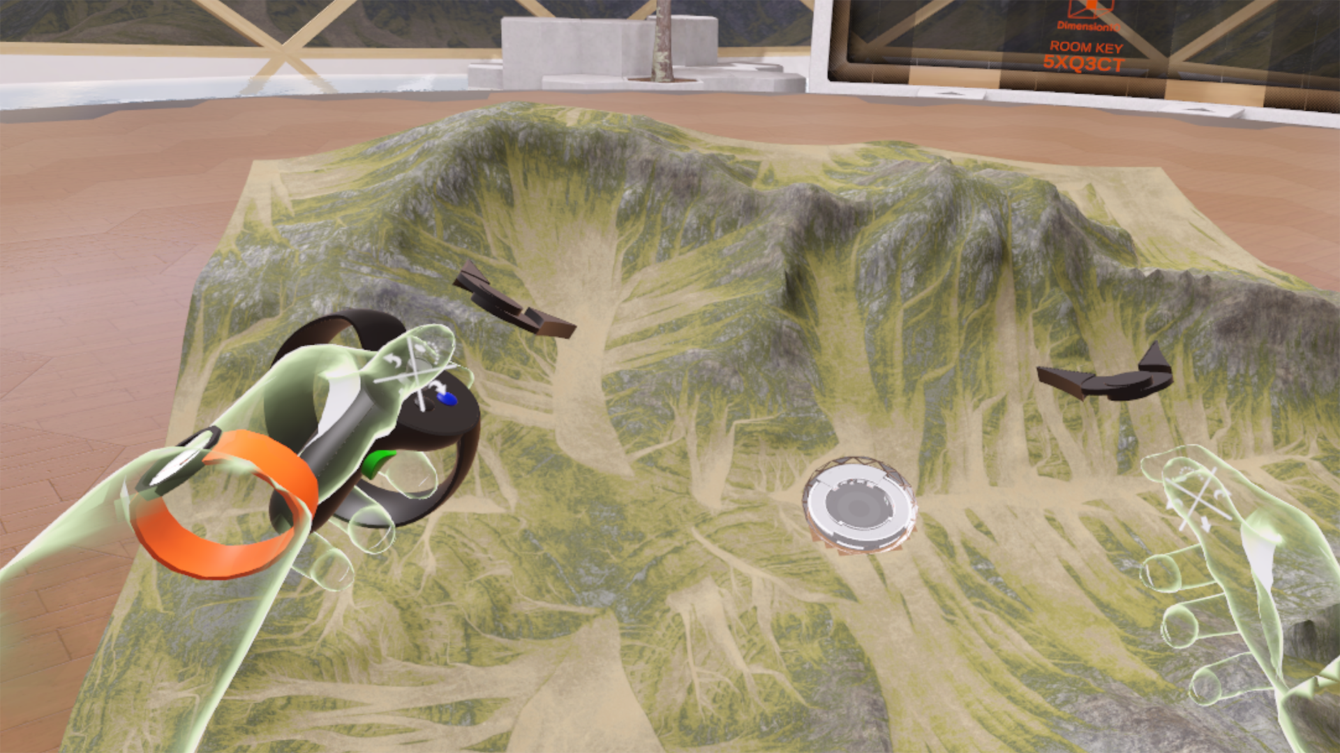
We used Dimension10’s VR collaboration software in the design process looking at the 3D models and entering into them at 1:1 scale to discuss the design. Here I am holding a 3D model of a preliminary design complete with the surrounding terrain

The positive effects of nature and natural surroundings on human well-being and productiveness is well documented in environmental psychology studies. Bringing trees and water inside the building combined with ample large windows allowing views of the sky and natural landscape are key features of the design. A high ceiling with a view to a blue sky aids in creative thinking in helping with mental relaxation exercise which makes us more aware of possibilities afforded by our own imagination.

Studies show that curved objects and environments have a higher restorative effect than rectilinear ones. The pavilions surrounding the plaza will likely be used less but provide a more intimate work space, add visual complexity and encourage exploration in the environment, qualities which are associated with environments that are interesting and comfortable to be in. The hexagonal abstract landscape is a nod to Japanese gardens and contrast the curved elements.

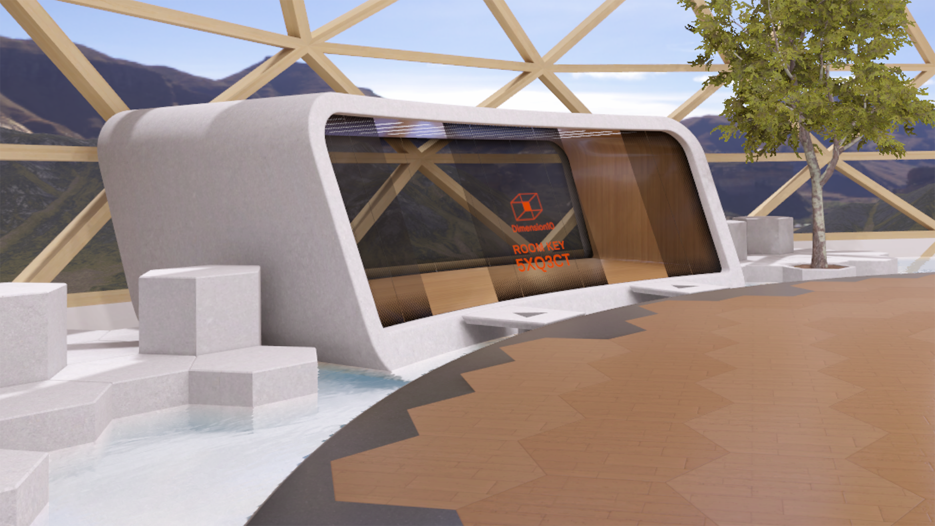
To meet up with others in VR users have to enter a unique key. The key for the “room” you are in is displayed on the slanted glass walls of the pavilions. Floating stepping stones provide access to the pavilions that themselves “float” in the water surrounding the main floor. The half tone gradient pattern on the glass is inspired from car and train windows.

While there are no real, physical materials in virtual reality, it’s all pixels after all, using representations of natural materials such as wood and stone should increase comfort and restoration based on findings in studies within environmental psychology.

The only thing one can say with certainty when a building is complete and tenants are moving in is that the design will be changed - walls will be moved, torn down and repainted and new furniture will replace the old. Virtual reality is no exception. My original very fancy and costly - from a polygon budget pov - curved super screens had to go for more traditional rectilinear ones.

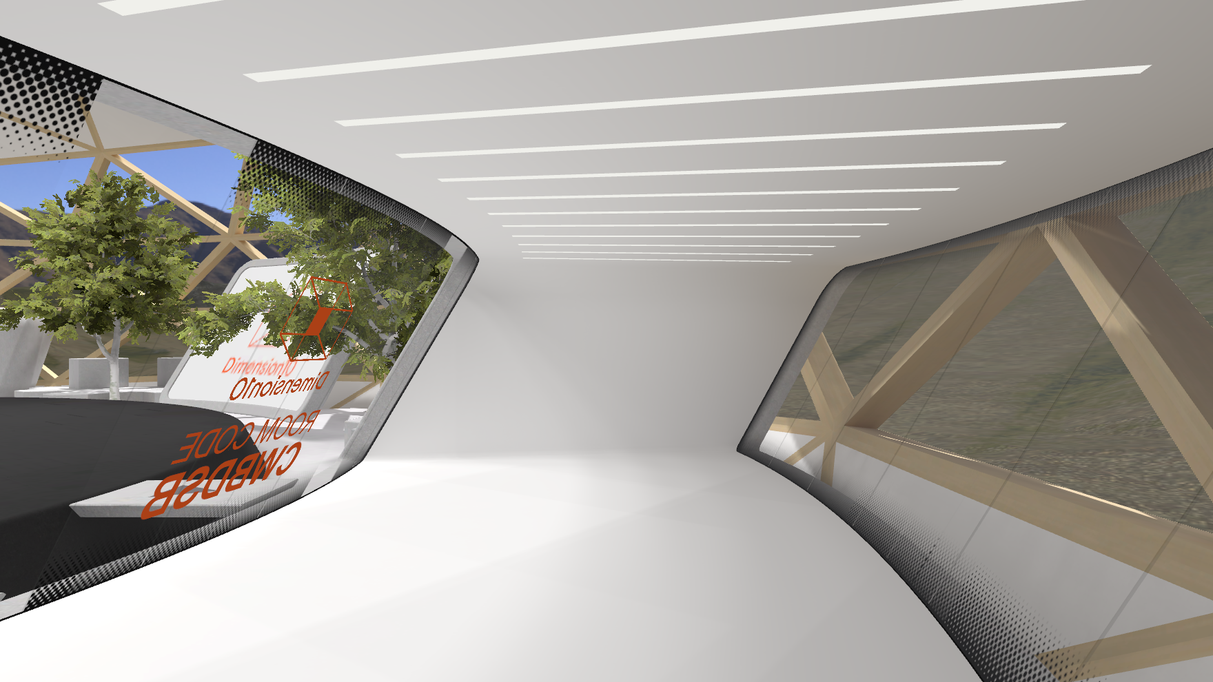
One reason for making the pavilion meeting rooms stand alone objects was to make it easier to change them later, ie making the ceiling taller or allowing access to their roofs etc. One thought I had was to allow users to change the materials themselves depending on project or activity. Here is a version with a white interior.

I don’t know many architects primarily interested in creating virtual architecture like I am. Spaces for play in entertainment titles like VR games, virtual theatre, music and documentary productions yes, but not for work. I do believe that more and more people will meet and work (and play) virtually in the future and I like to think of myself as pioneering this field.